


No, screens aren’t ruining modern cars, and I’m sick of pretending they are

Callum Tokody
Author of the post
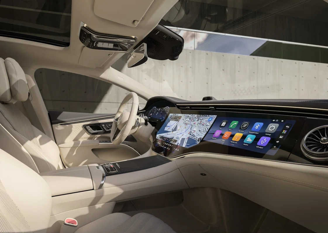
Car software is becoming intolerable, and I am tired of pretending car screens are the problem. They may cover the entire dashboard, provided the infotainment system was designed by somebody who remembers that its user is travelling at speed, while touchscreen controls must make common functions immediate rather than turn temperature adjustment into clerical work. Some manufacturers understand this; others appear to have mounted a tablet, changed the wallpaper and considered the interior finished.
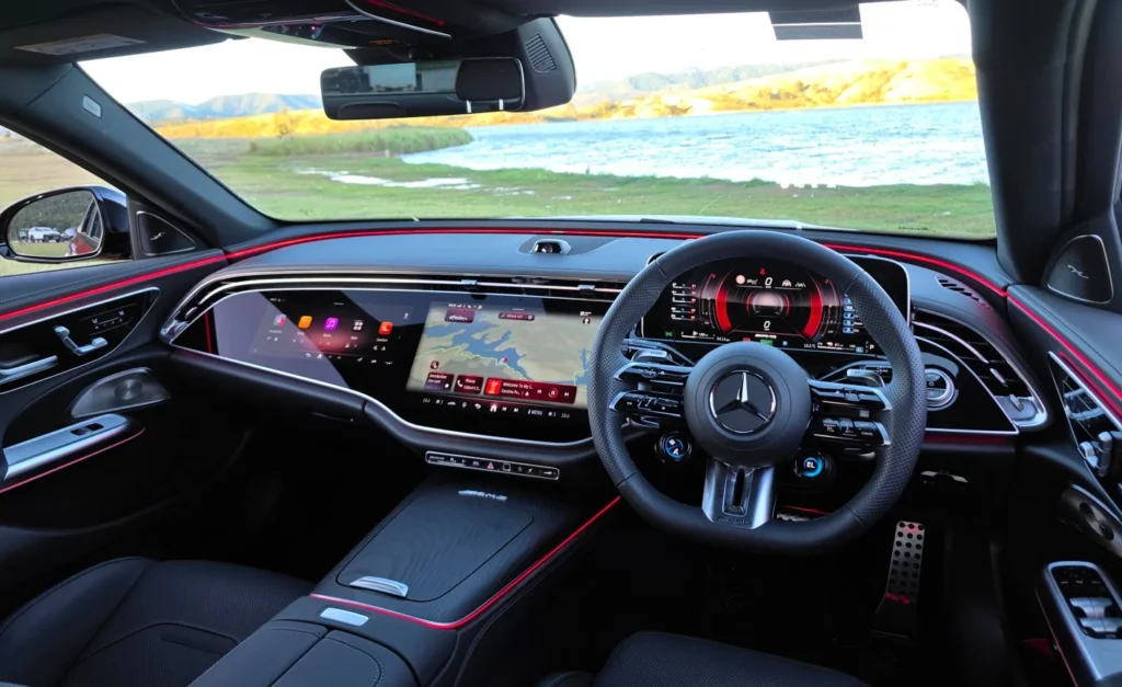
Good car software knows it is inside a car
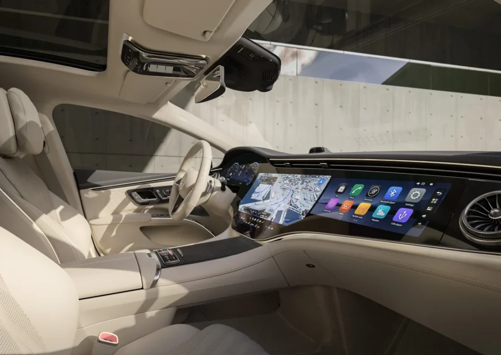
I do not have a philosophical objection to screens. That argument has become tedious anyway, usually collapsing into a choice between a dashboard modelled on an airport control tower and one containing walnut veneer, three rotary dials and a cassette slot. Large car screens can work. Mercedes-Benz proves that often enough, despite fitting some cabins with sufficient display area to host a modest film festival.
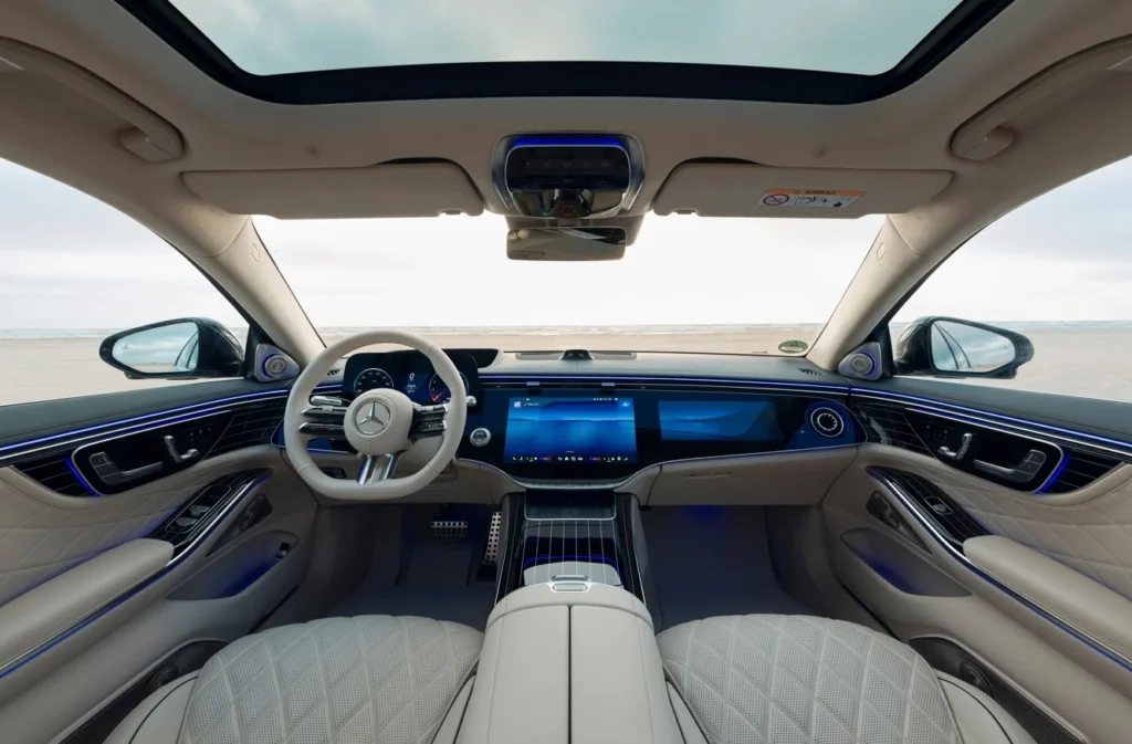
The MBUX Hyperscreen is huge, theatrical and difficult to ignore. It is also far easier to understand than plenty of smaller systems because the software gives useful information priority. Navigation, media and frequently used functions are kept close to the surface. The driver does not have to dig through a set of brightly coloured menus every time they want to adjust something ordinary. That is what good car software looks like. It understands that hierarchy matters, that the driver has limited time to look away from the road and that not every feature deserves equal prominence.
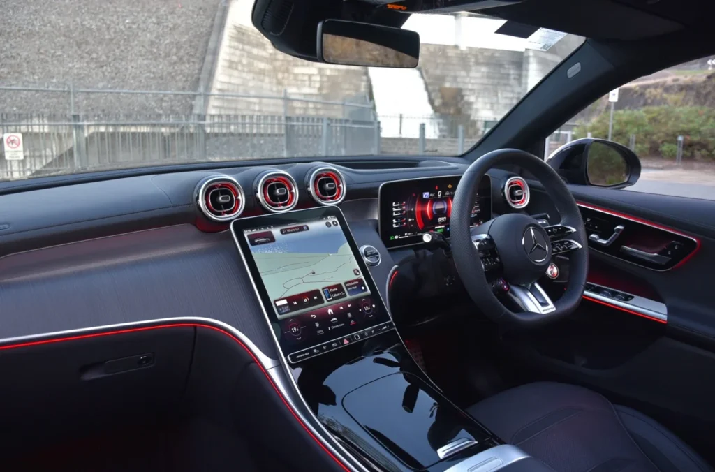
Mercedes also gives its infotainment system a visual identity. The typefaces, colours and animations belong with the rest of the interior, rather than looking as though they were added by a supplier who had never seen the dashboard. There are still irritations. Some touchscreen controls demand too much attention, and Mercedes occasionally gets so carried away with ambient lighting that the cabin begins to resemble an expensive aquarium. The overall logic remains sound. Even when the presentation is excessive, the software usually feels deliberate.
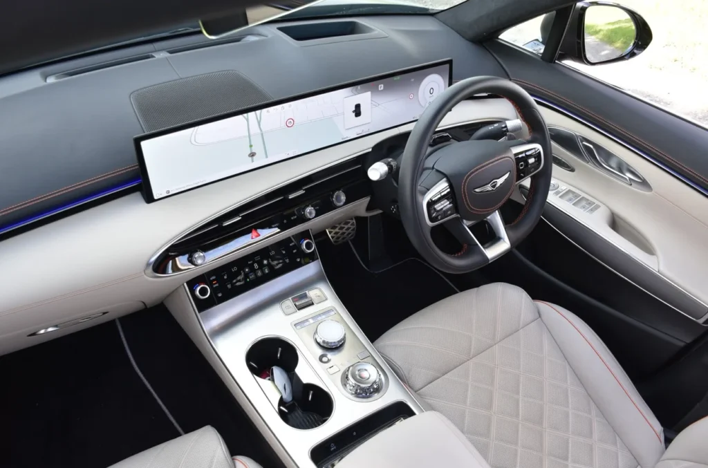
Genesis takes a quieter approach. Its car screens are wide and modern, but the company still uses rotary controllers and proper switches where they make sense. A controller is useful because your hand stays in one place. On a rough road, that is far better than trying to hit a small icon while the whole car moves beneath your finger. Hyundai generally reaches the same conclusion. Its cabins make extensive use of digital displays and connected features, but many models retain dedicated buttons for climate and other frequent functions. This should be unremarkable. A driver should be able to change the fan speed without leaving the map, opening a climate menu and wondering whether the latest software update has moved everything around.
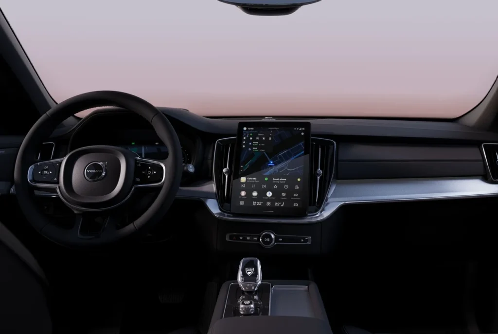
Volvo relies more heavily on the screen, though its Android-based infotainment system is usually clear enough to forgive the dependence. Navigation stays prominent, the home screen is sensibly arranged and the graphics suit the restrained character of the cabin. The climate controls can still be buried too deeply. Volvo is hardly alone there, but the broader design remains coherent and the interface rarely feels like an unrelated device mounted in the middle of the dashboard. That relationship between software and interior design matters. Mercedes car screens are theatrical because Mercedes interiors have become theatrical. Volvo keeps everything subdued because restraint is part of the brand.
Genesis uses measured graphics and solid physical controls because it wants the cabin to feel calm. The software participates in the design rather than interrupting it. Porsche is less convincing. The company can spend years refining steering weight, pedal response and seating position, then greet the driver with an infotainment system that looks as though it arrived shortly before the launch event. Porsche Communication Management has improved considerably. Newer cars are faster, better connected and more capable, but the software still tends to feel secondary to the hardware.
Some menus are sparse without being intuitive. The layout can look clean while requiring more thought than it should, and the visual language lacks the confidence found elsewhere in the car. That was easier to overlook when the screen was merely another feature. It becomes harder to excuse when the infotainment system dominates the cabin and appears so prominently in the sales pitch. Porsche gives enormous attention to the way a car responds to pressure through the steering wheel. It could spare a little of that effort for the moment somebody tries to find the seat-heating control. Apple CarPlay and Android Auto help. They are often the quickest route around weak car software, which is not exactly flattering to the manufacturer but remains useful to the owner.
A car should not feel like a tablet with wheels
Tesla established the modern obsession with placing almost everything inside one central display. The original approach was radical and coherent because the company designed the whole cabin around it, but the philosophy spread much faster than the ability to execute it well. In the Model 3, the screen controls an extraordinary range of functions, including the direction of the dashboard vents, while opening the glovebox requires selecting Controls and then Glovebox. Tesla owners learn these processes, but familiarity does not transform questionable touchscreen controls into good ergonomics.
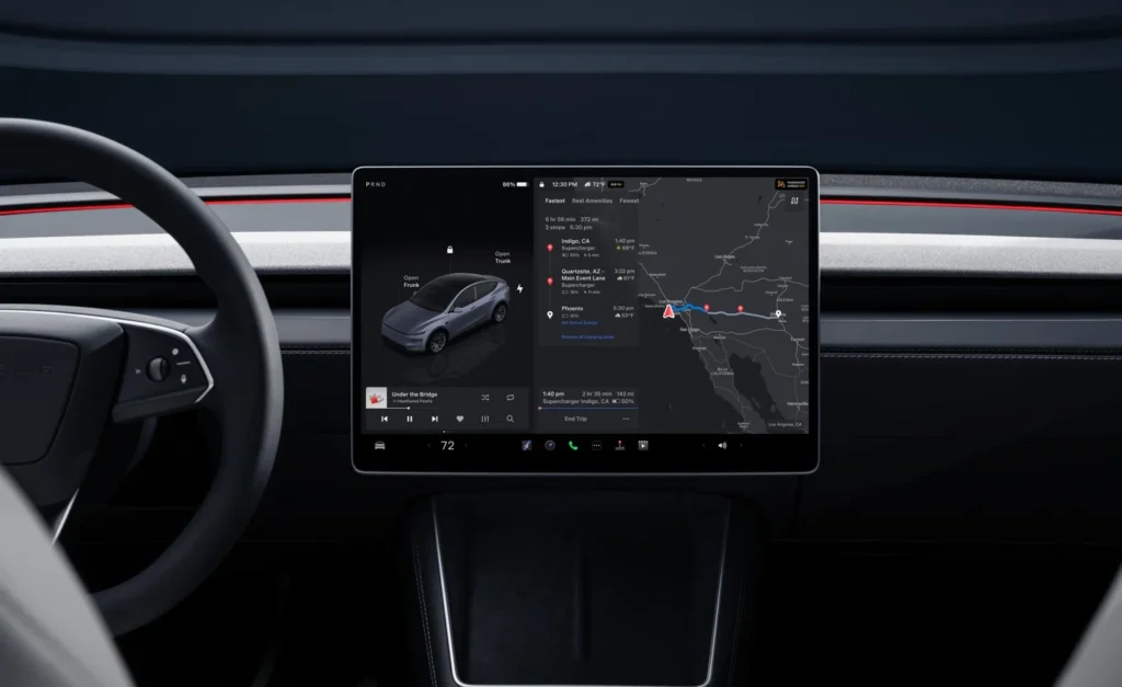
Human beings can become efficient at almost anything with repetition. A driver could probably master opening a glovebox through an infotainment system within a week, but that does not explain why the glovebox needed software in the first place. Voice commands are routinely presented as the answer, and they can reduce interaction with car screens when the system understands the request. They are not a universal replacement for a switch, because passengers talk, music plays and not every driver wants to announce to the cabin that their backside has become cold.
A physical control does not mishear you and remains in the same place after an update. That predictability is not nostalgia; it is competent interface design. Many newer Chinese vehicles inherit Tesla’s central-screen philosophy but add a different problem: the interface can resemble a generic consumer tablet. Bright icons, rounded tiles, app pages and animated graphics compete for attention, while the infotainment system feels visually detached from the cabin surrounding it.
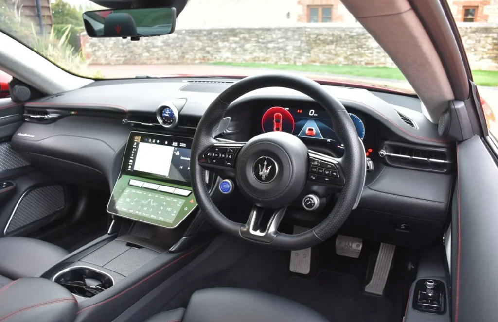
BYD is an obvious example. Its rotating display is memorable and responsive, but the wider design still relies heavily on layered menus and touchscreen controls, producing an experience that is technically capable without always feeling distinctive. “The software does the job” is faint praise in a vehicle costing tens of thousands of dollars. A microwave also does the job, but I would be disappointed if the dashboard of a new car adopted the same graphic design.
The problem is not the use of icons or applications, because every modern operating system relies on them. It is that too many examples of car software feel interchangeable, as though removing the manufacturer’s wallpaper would leave something equally suitable for an electric SUV, a home appliance or a shopping-centre directory. An iPad is designed for somebody holding it close, usually while stationary. Small targets, multiple pages and swipe gestures are manageable because the user can stare directly at the device and support it with both hands.
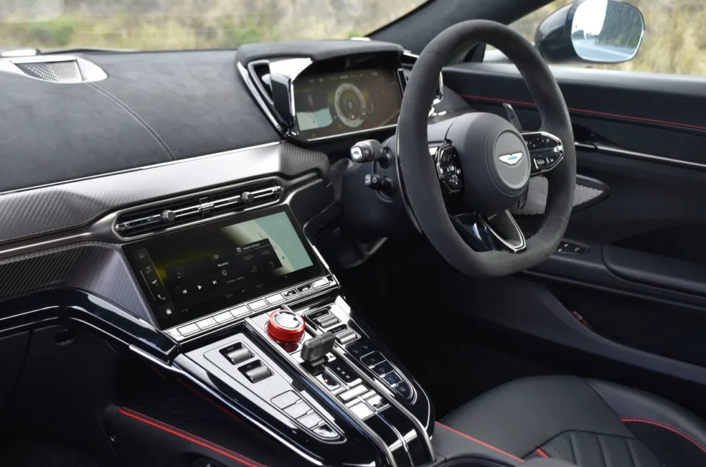
Car screens sit at arm’s length in a moving cabin. The driver may be wearing sunglasses, the road surface is moving their hand and their attention should be directed somewhere else, so touchscreen controls need larger targets, fewer choices and much stronger prioritisation than ordinary consumer electronics. Navigation matters more than a streaming app, demisting the windscreen matters more than an ambient-light animation and seat heating will be required more often than an avatar editor. When the infotainment system presents all of these functions as equal tiles, the driver must stop reading the road and begin reading the operating system.
The strongest car software behaves like a good concierge. It notices what is useful, presents it clearly and moves out of the way, while the worst resembles a shopping-centre directory with several sponsored suggestions and no obvious route to the toilets. There is another reason this matters: software now defines how expensive a car feels. Leather, metal and glass may create a beautiful cabin, but lag, childish graphics or clumsy language on the central display can dismantle the illusion instantly.
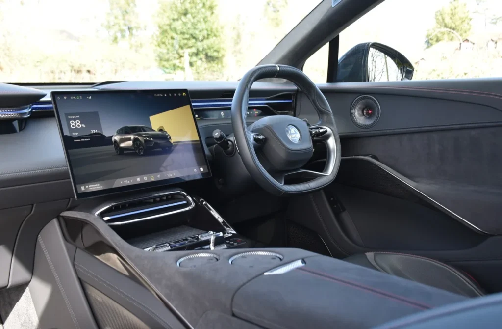
A poor infotainment system makes an expensive vehicle feel unfinished, while a considered one can lend coherence to an otherwise ordinary interior. Genesis uses restrained colours and careful spacing, Mercedes makes its vast car screens theatrical enough to justify their presence, Hyundai adapts similar technology without making it feel disposable and Volvo keeps its interface quiet because restraint suits the brand.
Tesla’s minimalism is also intentional, even when it hardens into inconvenience. The more frustrating products are those in which a carefully drawn exterior and neatly trimmed cabin meet car software that appears to have been purchased by the metre. You can almost see the point at which the design department surrendered. The dashboard curves elegantly around the driver, only for the centre display to reveal pastel icons, inconsistent type sizes and a cartoon vehicle rotating in the middle.
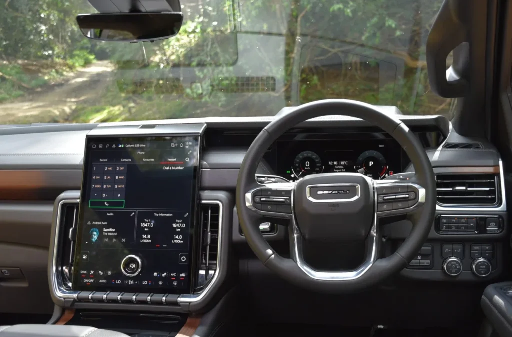
Nothing kills atmosphere faster, and there is little excuse left for it. Manufacturers employ substantial software teams, build app stores and advertise over-the-air updates as major selling points, while Porsche describes its App Centre as a platform intended to evolve through the Macan’s life and Volvo is already distributing interface changes to existing cars. Software is no longer a radio with a map attached. It controls climate, charging, assistance systems, entertainment, navigation, seating and often basic vehicle settings, making bad touchscreen controls the modern equivalent of placing the steering wheel somewhere inconvenient.
Car companies may fit as many displays as they like. Fill the windscreen with projections, give the passenger a cinema and install another screen in the door if somebody can explain why it belongs there, but the interface must still be designed for a driver. Frequent functions should remain visible, type should remain legible and physical switches should survive wherever touch adds nothing. Good car software does not treat touchscreen controls as a moral obligation.
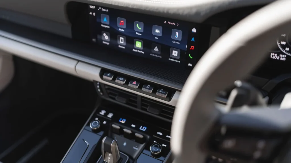
Important settings should not disappear into app folders, and the graphics should bear some relationship to the car surrounding them. Knowing how to use a smartphone does not mean wanting a vehicle to behave exactly like one. A car is a machine travelling at speed among other machines, pedestrians, cyclists and concrete objects. Its infotainment system should respect that fairly obvious distinction.
The next great automotive interior will not necessarily contain the fewest car screens or the most. Better car software, rather than greater display acreage, will decide whether those car screens feel useful or merely unavoidable. Good touchscreen controls should disappear into the task rather than become the task. Mercedes, Genesis, Hyundai and Volvo frequently approach that standard because their best interfaces feel designed rather than installed. Porsche needs to give car software the attention it gives chassis tuning, Tesla needs to accept that minimalism sometimes becomes inconvenience, and the emerging brands copying tablet layouts need to understand that an app grid is by no means revolutionary.
latest Stories
 Read full story

Join Our Community
Stay up to date with our latest stories, fresh insights, and special updates. Subscribe to receive carefully selected content delivered straight to your inbox.